


I have always been a strong believer in the idea that good design can make the world a better place and that most of the worlds problems are design problems that need to be solved.
One of the biggest problems that we face is the growing epidemic of chronic disease caused by poor nutrition. This is in large part caused by misinformation and lack of education in nutrition. Food labelling is a part of this problem and I would argue that current nutritional labelling is not fit for purpose for the following reasons:
Here in the UK, we currently display nutritional information on food labels in three forms.
The ingredients list is essential and genuinely useful, but the nutritional information chart and food traffic light do little to communicate how healthy a food actually is. Theoretically a slice of white bread could get green lights all the way, telling the consumer that is a high nutrition food, when of course it is not.
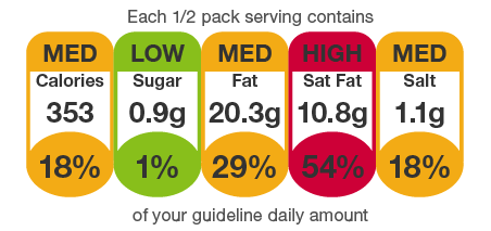
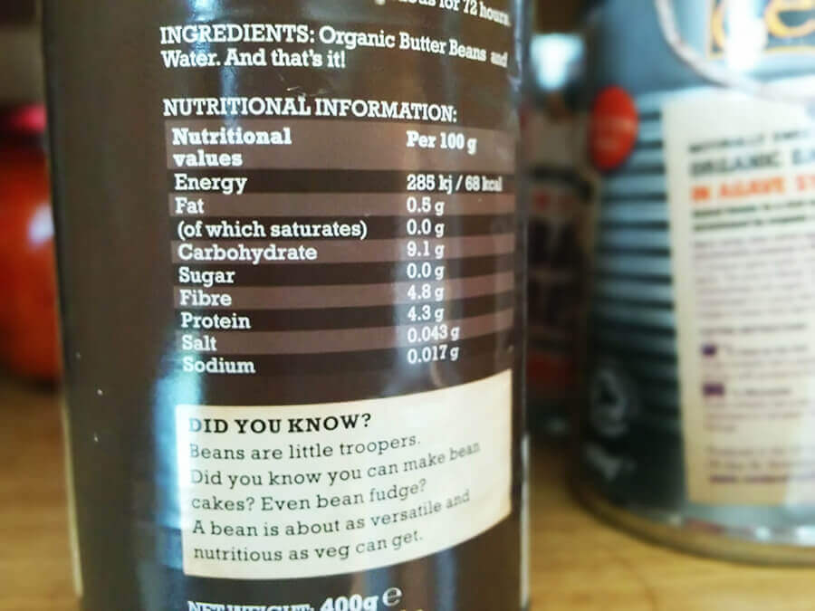
As for the main Nutritional Information chart (Nutrition Facts in the USA), it displays somewhat abstract data about a select number of individual nutrients. The chart is uninteresting, hard to read and like the traffic light, it doesn’t allow you to judge the true healthfulness of the food even if you are educated in nutrition. I run a web design company and when optimising sites for improved usability and conversion rates, we often talk about the 3 second rule. The user should understand your core message and know what to do within 3 seconds. How long would it take to assess the healthfulness of a food from the existing label design (if it even grabbed your attention at all)?
So my hypothesis is that if nutritional information labelling was designed well, people would make better food choices, even without any nutritional education. Considering that most people don’t have any nutritional education, this should surely be the design goal.
We need a standardised nutrition information label that grabs the consumers attention and effectively communicates the basic nutritional qualities of the food at a glance in an intuitive way.
So I propose a new nutrition information label that would tie in with some subtle changes in the way that ingredients are listed to help consumers make quick but informed choices.
The basic principle is that to make it useful, first we must make it usable. Simplicity is far more important than detail. If you want detail, you can go online for more information, read books or take a course in nutrition. We shouldn’t try to be cramming everything on to the back (or front) of a food packet.
For this reason I start the design with simply renaming the label from Nutritional Information or Nutrition Facts to Nutrition Overview. The danger with headings like Nutritional Information or Nutrition Facts is that they imply that they’re giving you all of the important information, when they are not. Changing the title simply sets more realistic expectations.
The main feature of the design is two simple pie charts. One represents the proportion of plants to animal foods and the other represents the proportion of refined to unrefined foods.
There is currently a huge body of scientific and practical evidence suggesting that a whole food plant based diet (or something close to it) is optimal for health, and so the nutritional information should make it easy to judge how close a food comes to meeting this criteria with a quick glance at the packet.
The charts are intuitively colour coded green/red for plants/animals and brown/white for unrefined/refined foods.
The charts show the proportions as a percentage of calories, simply because food intake is more easily measured in calories than by weight or volume.
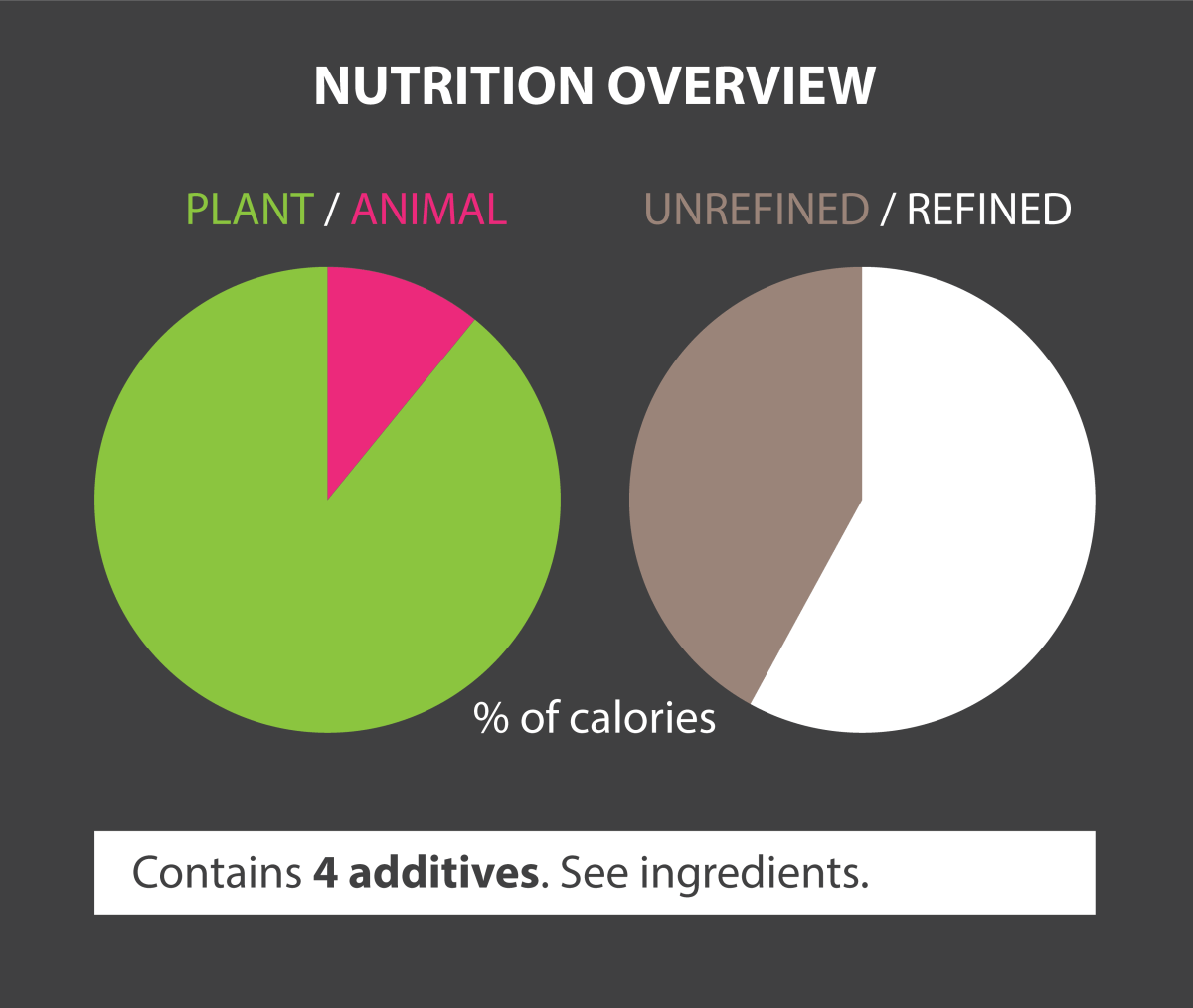
The charts would be drawn in 1 percent increments for simplicity. Any segment that was less than 1% but more than 0% would be rounded up to 1 percent so that the small segment was visible on the chart. This is important so that people do not think that any chart is 100% of one thing when it in fact contains a small amount of something else. This would be particularly useful for vegans who could glance at a packet and know that a complete green circle meant that no animal products were contained.
One limitation of drawing the charts by percentage of calories is that they cannot show non-calorie containing ingredients such as salt, preservatives, flavourings, emulsifiers and added vitamins and minerals. The exception would be water, which would not be classified as an additive.
All of these seem to fit well under the classification of additives and it seems reasonable that consumers should be made aware that the food contains additives. They can then make an informed choice regarding whether or not they want to consume them. Therefore, the chart simply states the number of additives in the food, which would then be highlighted clearly on the ingredients list.
No system is ever going to be perfect but I think this initial concept design is a big improvement on the current designs and would more effectively communicate key information about food and nutrition.
However, There are some issues that would need to be addressed before implementing it, such as:
Some might say that the biggest limitation of all is that it doesn’t actually tell people what is good or bad for them, but I think that is a good thing for a few reasons.
Firstly, I believe that we should start with first principles and tell people what their food is made of. They are then free to make informed decisions based on their own personal knowledge and beliefs. This is very well achieved using the combination of the Nutritional Overview and Ingredients labels.
Secondly, it would be far easier to get to buy-in from government and the food industry for an improved labelling scheme if it doesn’t actually make any statements about which foods are good and bad. The Nutrition Overview is inherently neutral in its design and therefore more easy to accept than something more prescriptive like a traffic light system.
Finally, if any label system is designed to explicitly tell people what is healthy and what is not, it is likely to be distorted by industry and government. This is potentially very dangerous and so it is much better to have a system that has little potential for manipulation and distortion.
Below are a few examples of how the new labelling system would work. Please note that the data shown on these examples is approximate.
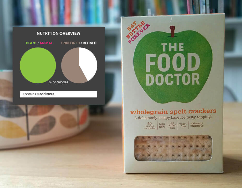
Example #1: Food Doctor Wholegrain Spelt Crackers
It might be fair to assume from the name that this is an entirely whole foods product, but unless you read the ingredients list you would not realise that it is only just over half made of wholegrain. The Nutrition Overview would make this obvious at a glance, but also communicate some positive attributes like the fact that it is 100% plant based and contains no additives.
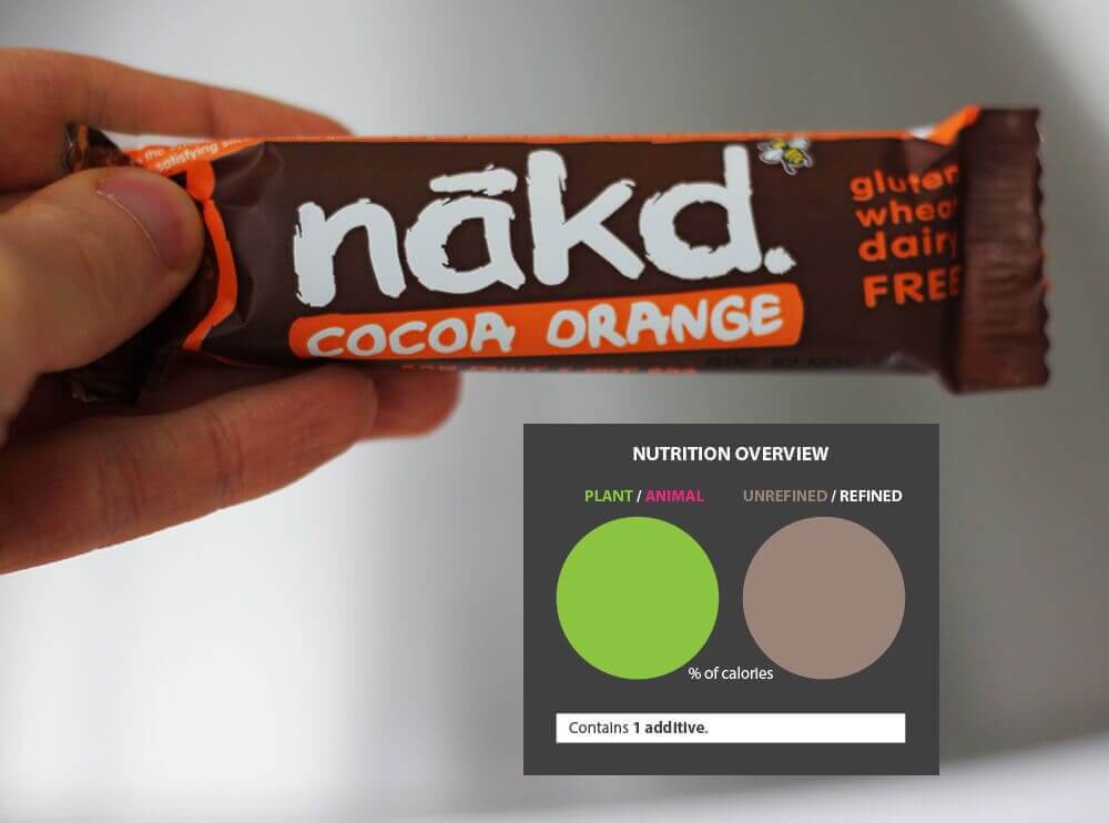
Nakd promote their bars as “whole food” products and this would be immediately evident from the Nutrition Overview, but it also highlights the fact that this product contains an additive (orange flavouring), which many consumers might not otherwise have been aware of.
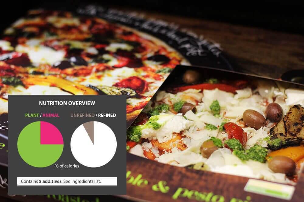
Many people might think that a roasted vegetable pizza is relatively healthy (I am speaking from experience!) but the Nutrition Overview immediately tells us that it has a fairly high animal food content and is predominantly manufactured from refined food products.
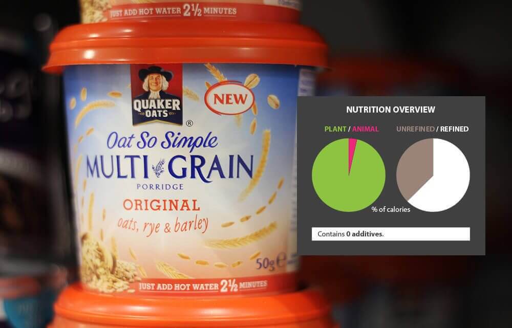
Oats are widely considered to be a healthy breakfast option but the chart reveals that the whole food content in these instant oats is much lower than in traditional porridge.
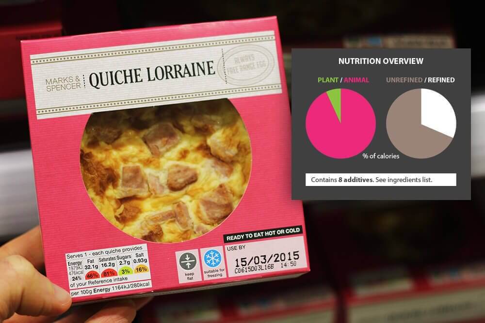
The quiche is really interesting because it doesn’t contain very much meat but yet is almost entirely animal based. It also raises a really interesting question about how we define whole foods and draw the line between refined and unrefined foods. For this example I have treated egg, pork and whole milk as unrefined, but cheese as a refined food. No doubt this is an area that needs further exploration to ensure that a clear and fair definition or grouping is achieved.
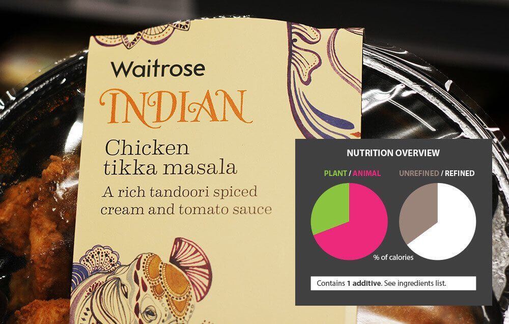
I thought I would include Britain’s favourite dish as the last example. This is actually quite a strange example because the plant element is primarily formed of vegetable oil (with a small amount of vegetables) but on the other hand, the unrefined food element is formed mainly of the chicken. Thought provoking!
I think food labelling is a really important issue and so it would be great to get constructive feedback and ideas on this proposed design and on any alternative ideas, together with ideas on how new ideas could actually be presented to the relevant authorities. Please do leave a comment below or message me privately.
Brilliant. So well thought out and expressed. I love your ideas and design. Totally agree with you philosophy of design as well. Thank you for sharing!
Ariane
Thanks Ariane! Great to hear your positive thoughts 🙂
Tom Greenwood
An elegant solution to food labeling. Simplifying, yet presenting the most important information, to make an easy choice for the greatest number of people..brilliant! I believe that the allergy information is important to have clearly visible on the label. I know several people with food allergies, and I feel that allergen info needs to be easy to find on the label. The calorie content is tougher. One of the biggest problems with labels today is the unrealistic and hard to compare “serving size” that manufactures use to try and skew the calorie content of the product to make it more attractive to consumers. My choice would be to list the total calorie content of the package, and let the consumer decide how much of the total package to eat based on that total calorie number.
Awesome article! Thank you for posting this.
Alan McComas
Thanks for your feedback Alan. Yes, you are absolutely right that allergy information is important. This might be something that could be handled with clear highlighting on the ingredients list. For example, here in the UK common allergens are displayed in bold on the ingredients list, which makes it quite easy to scan the list and identify them. However, it would be easier (especially for people with visual impairments or reading difficulties) if there was a simplified way of indicating the presence of any allergens.
I also agree with your point about serving sizes being misleading and that stating the total of the packet is more straight forward. The exception would be when selling multipacks, as it might then make sense to state the total calories of the individual items inside (or perhaps state both).
Tom Greenwood